5 min read
The importance of typeface in design

Typography is both an art and a technique that involves arranging type to make written language legible, understandable, and visually appealing. It’s not just about aesthetics but also about how a message is communicated through the written word.
Mastering typography takes practice and experience, and in my case, it’s a skill I continuously refine. But let’s start with the basics: what’s the difference between typography, typeface, and font?
Typography, Typeface, and Font: What’s the Difference?
Typography encompasses all the elements that make written communication effective—format, spacing, alignment, and overall layout. In essence, it’s the backbone of any written communication.
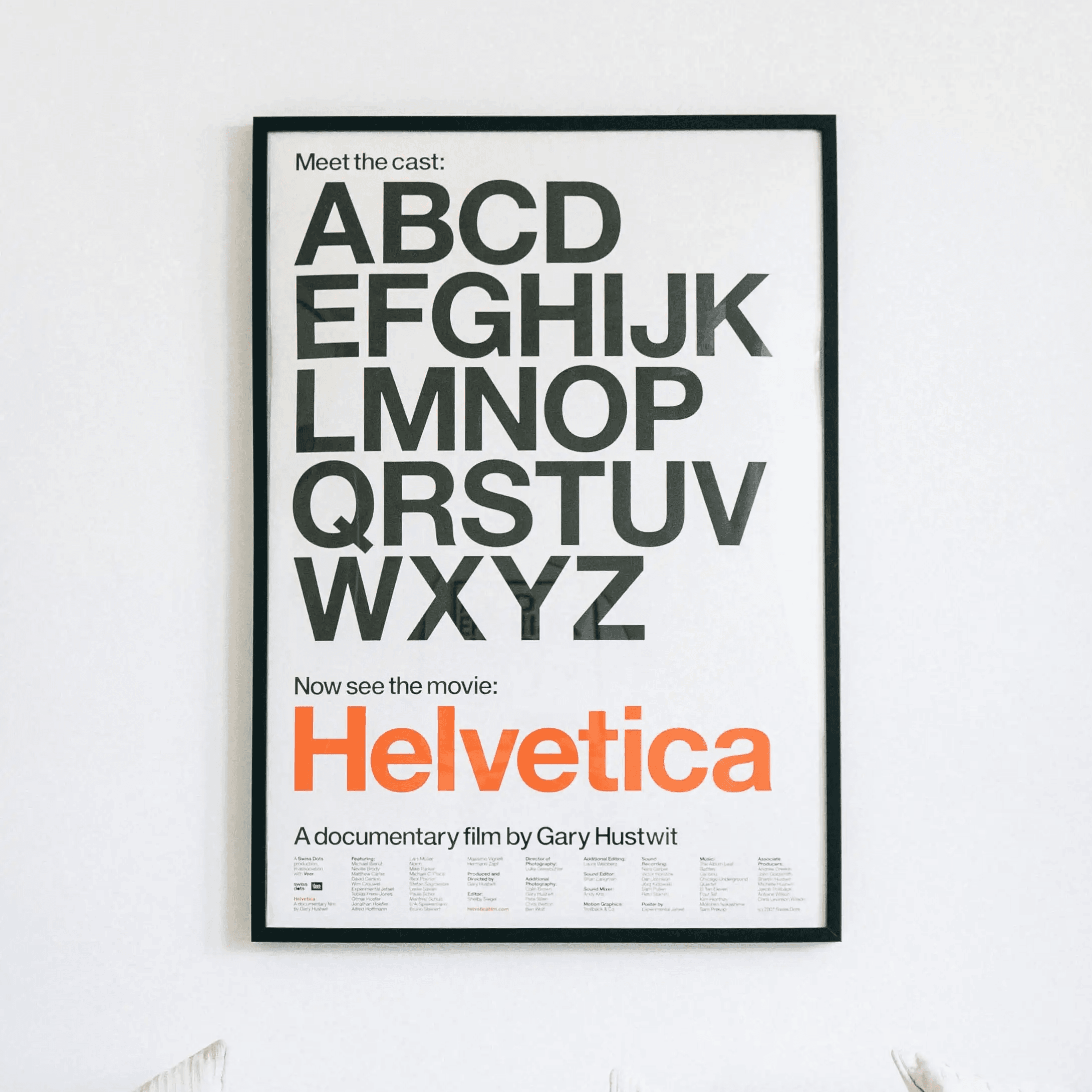
A typeface refers to the design of the letters, giving them a distinctive style and personality. Well-known typefaces like Times New Roman, Helvetica, and Roboto each have their own character, setting a different tone and emotion. Fonts, on the other hand, are the specific styles and sizes of a typeface, like Roboto Bold or Roboto Regular.
Regardless of the font you choose, fundamental elements such as contrast, spacing, and size must be respected to achieve an effective result. If you’d like to dive deeper into typography rules, you can explore more here and here.
How Typeface Choices Can Change Your Message
What I want to emphasize in this post is how something as simple as changing a typeface can completely alter the mood or message of a design. To illustrate this, let me share an example from an eCommerce store project I worked on.
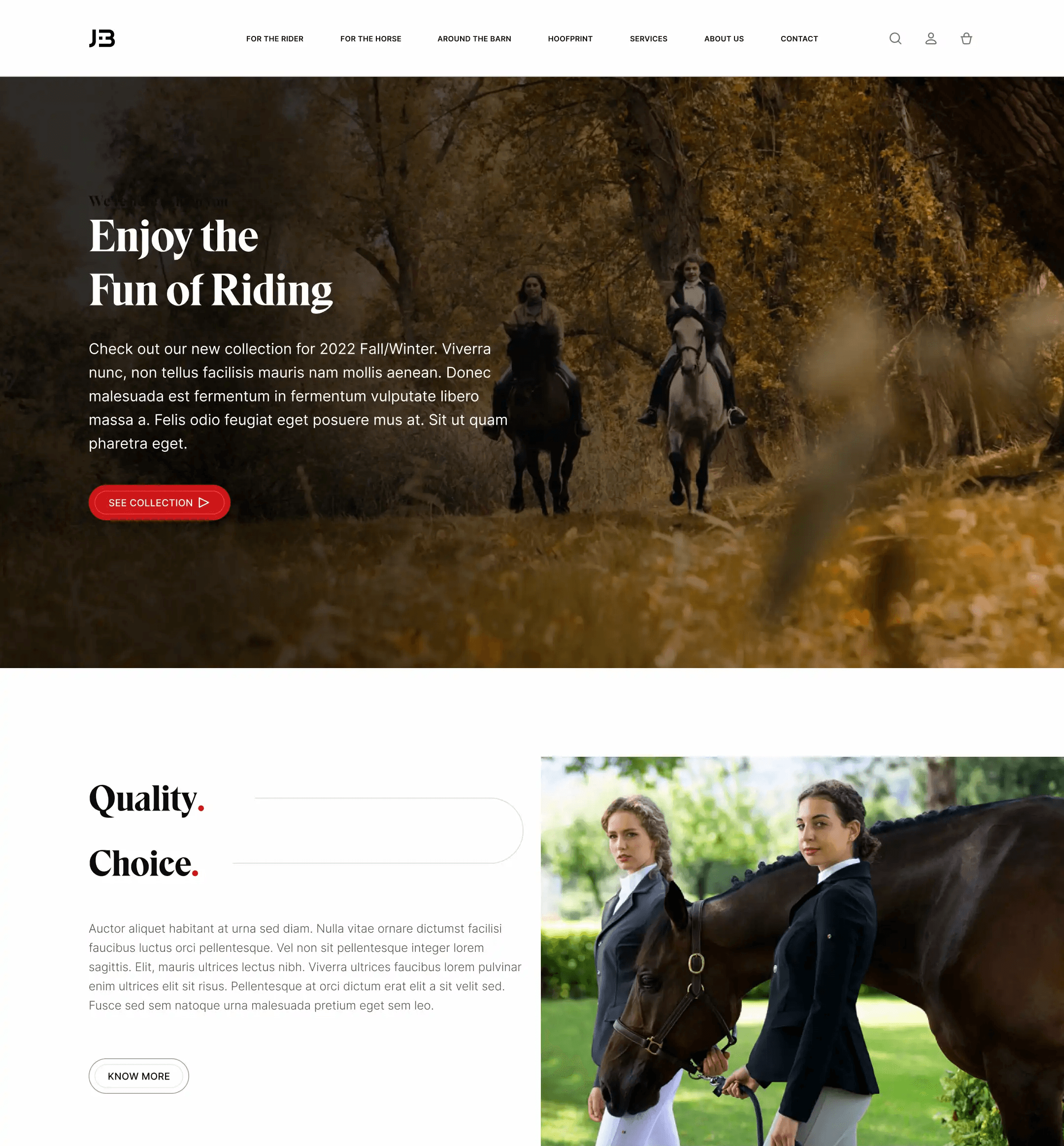
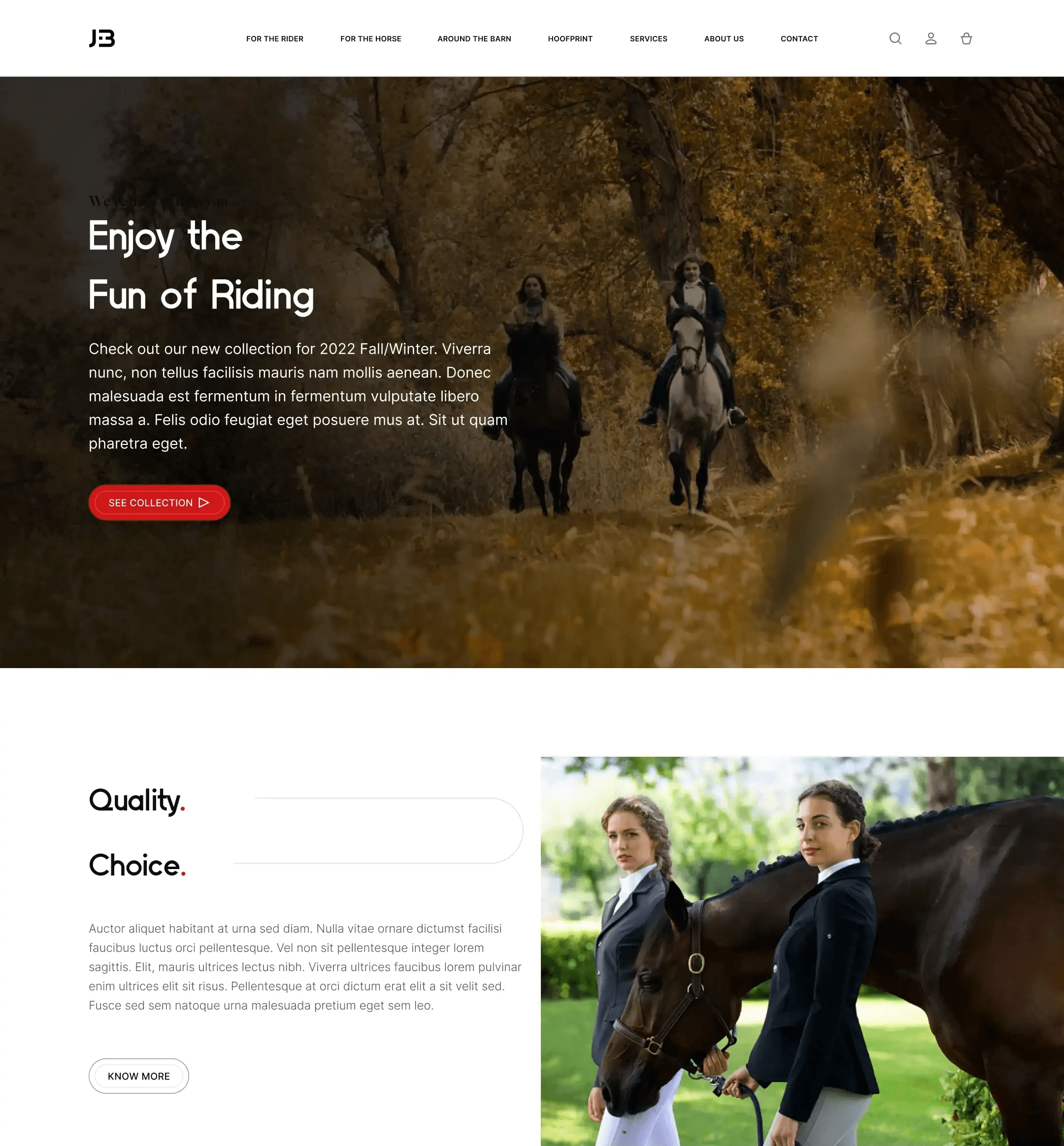
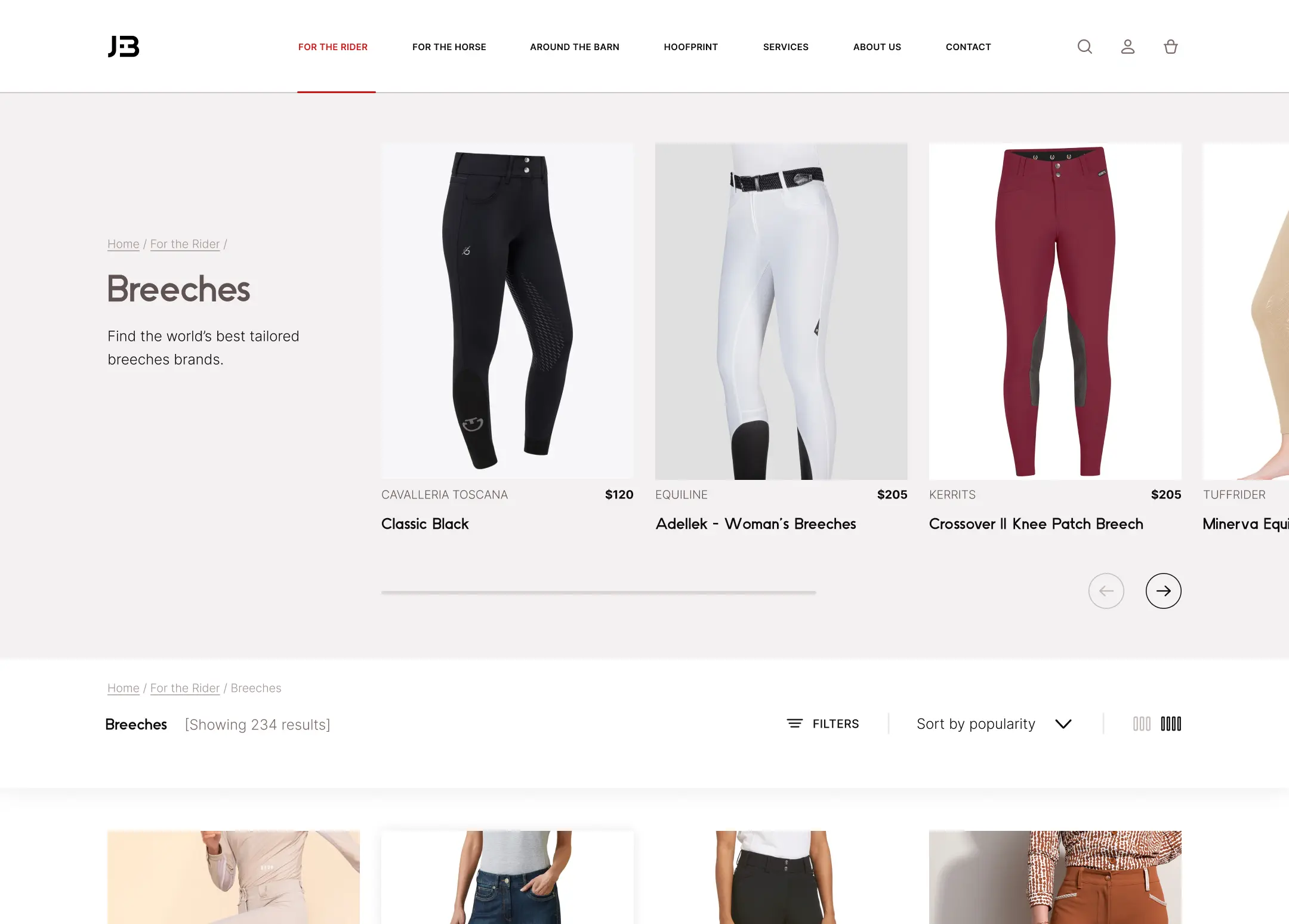
The brand sold high-end, multi-brand sports apparel with a focus on luxury and exclusivity. Initially, we used the Eksell Display typeface for the headings—a display font with a refined, linear design that conveyed sophistication and elegance. However, near the end of the project, the client opted for a different font—Waycli, a non-serif, rounded font with a more playful and relaxed feel.
Despite the same design and layout, this simple change in typeface resulted in two drastically different messages. Here’s a visual comparison:

Image 1. a): Homepage with Eksell typeface

Image 1. b): Homepage with Waycli typeface

Image 2. a): Category page with Eksell typeface

Image 2. b): Category page with Waycli typeface
The Role of Typeface in Defining Your Brand
Choosing the right typeface is less about finding the "best" type and more about finding the right one(s) for your specific context. For instance, if you want to project a fun, casual vibe while emphasizing readability, Waycli might be a good fit. But if your goal is to communicate luxury, professionalism, and trust, Eksell Display would be the better choice.
In the end, there’s no absolute right or wrong when it comes to typeface selection—it’s about aligning the typeface with the identity and message you want to convey.
need a trustworthy design partner?
Discover what JB Studio can do for you. Let's talk about what you're building and how we might be able to help.
More articles
What Makes a High-Converting Dental Website?
A high-converting dental website is one that builds trust quickly, clearly explains services, and makes it easy for patients to book an appointment. The best-performing sites combine strong visual credibility with simple navigation and clear calls to action.
5 min read
Read post
Read post
The Importance of a Website for a Local Business
A website is a crucial element for generating results online. It serves as a destination for potential customers and offers complete control over the content, unlike social media platforms where businesses are dependent on external algorithms.
5 min read
Read post
Read post